Top Left
Vision
Vision is where every business begins.
Before strategy. Before software. Before branding.
Every meaningful decision begins with understanding where you're trying to go.
Without vision, everything else becomes reaction.
The Mosaic Identity
The Mosaic identity wasn't designed to look interesting.
It was designed to explain how we believe businesses work.
Every shape. Every color. Every decision.
Each represents a principle that guides the way we think.
Why Mosaic?
A mosaic is created from individual pieces that become more meaningful together than they ever could apart.
Businesses work the same way.
None of these create a great business by themselves.
The real value appears when they support one another.
That idea became the foundation for everything Mosaic represents.
"The whole is always greater than the individual pieces."
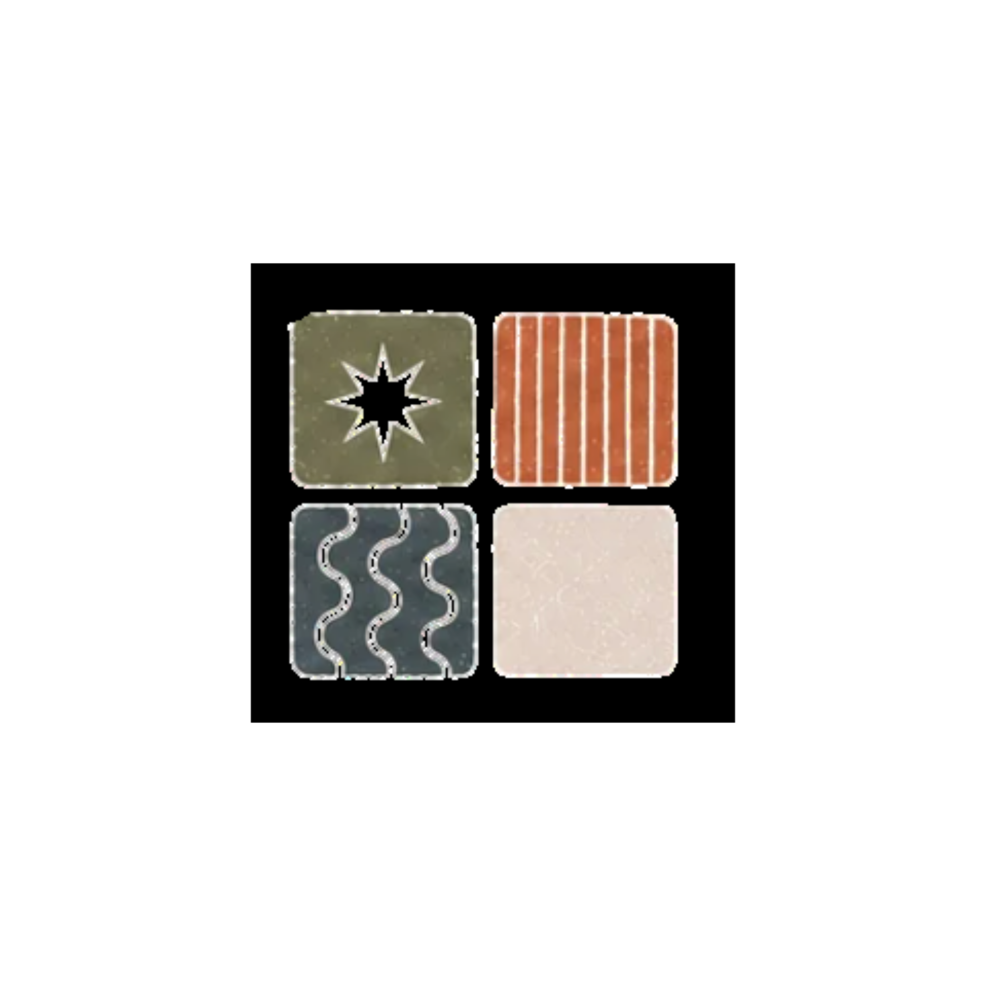
Top Left
Vision is where every business begins.
Before strategy. Before software. Before branding.
Every meaningful decision begins with understanding where you're trying to go.
Without vision, everything else becomes reaction.
Top Right
Structure turns good ideas into repeatable ways of working.
Processes. Systems. Documentation. Expectations. Consistency.
Growth becomes possible because structure makes success repeatable.
Bottom Left
No department works in isolation.
Marketing affects operations. Operations affect customer experience. Technology affects leadership.
Connection reminds us that every decision influences another.
Great businesses understand those relationships.
Bottom Right
Craft is thoughtful execution.
Not perfection. Not decoration.
Intentional choices made with care.
The experience people have with a business is shaped by hundreds of small details. Craft is respecting those details.
The Colors
Olive represents growth, clarity, and calm decision making. It gives the identity a grounded quality and reflects the kind of steadiness businesses need when decisions feel tangled.
Terracotta represents creativity, momentum, and human connection. It keeps the system warm and reminds us that businesses are built by people, not only processes.
Slate represents thoughtful systems, stability, and confidence. It brings structure to the palette without making the brand feel cold or mechanical.
Plaster represents openness, simplicity, and room to think. It creates the quiet space around the work so the important pieces can be seen clearly.
Typography
Businesses are both emotional and practical.
The serif reflects thoughtfulness, permanence, and humanity.
The sans-serif reflects clarity, precision, and modern execution.
Neither works as well without the other.
"When every piece has purpose, everything works beautifully."
This is more than a tagline.
It is the standard every recommendation should meet.
If a process doesn't create clarity, it probably shouldn't exist.
If software creates more confusion, it probably isn't solving the right problem.
If a decision doesn't support the larger vision, it deserves another conversation.
Every engagement returns to the same question:
Does this have a purpose?
Designing A Business
Someone designed it.
Sometimes that design happened consciously.
Sometimes it accumulated over years.
Mosaic exists to make those decisions intentional again.
Not Just A Logo
The logo is only the visible reminder.
The real identity lives in the decisions behind it.
Those choices matter far more than a symbol ever could.
Brand In Practice
Every engagement begins by understanding the business.
Systems become simpler.
Departments work together instead of independently.
The final experience feels thoughtful from beginning to end.
Great businesses rarely need more. They usually need greater clarity about what already exists.